 Contact Us


11
2010
september

Name : Raj Kamal
Contact No. : +91 +919713030021
E-Mail : Raj@omscorps.com
CEO , OMSOFTWARE
Social Media


An idea is always considered ridiculous till it proves itself a phenomenon. Same can be said for e-commerce that met with huge criticism in its early days, is it safe or not? Is it viable or not? With the popularity of the internet and stupendous advancement in the fields of mobile technology, e-commerce is here and that too, with a bang. Sites that are equipped with proper phone-support get a huge advantage and are preferred by world leaders such as android, blackberry etc.
These claims are backed by evidence based on facts and numbers. ABI research has estimated that online shopping via mobile technology in the United States of America. from the year 2008 to 2009 more than trebled, reaching a whopping $1.2 billion. It is estimated that panning the globe, customers will splurge $119 billion by the year 2015 via mobile online shopping, constituting roughly 8% of all the e-commerce happenings. Juniper Research has gone a step ahead and estimated that the entire value of mobile transactions will multiply fourfold from $170 billion today to a staggering $630 billion at the end of the year 2014.
Hence, mobile e-commerce looks to grow exponentially in the near future. What must be your plan of action then? First and foremost make a website that supports the use of mobile devices. It should not only be mobile-friendly but also be designed so as to accommodate all the restraints in the mobile devices. This would be a well-defined step in the direction of the ever-growing, ever-changing industry.
You must remember that a mobile screen cannot and will not possibly be as large as a monitor or laptop screen. Even the mobile phones that boast of large screens are comparable to our palm size, so it would be a smart move to cut down on ornamenting your web-site and make it strong in content. Since a customer using a smart phone for business deals is probably a busy person and wouldn’t like to scroll through unnecessary pictures before getting down to business. The page should be well-organized and intuitive in navigation.
Try to use relatively bigger fonts, remember that one would use the mobile phone for business while on the move and not in a comfortable room with a desk. It would be practically impossible to read small fonts on your mobile phone screen while in a car or a train. The user shouldn’t have to strain their eyes in order to work; they already have enough stress to deal with.
Navigating the mobile site should be made simpler as compared to standard web pages, since it requires getting used to. Try to reduce the number of links and keep and option to go back to the home page directly on every page, this would save time and confusion. Online shopping sites have gained major acceptance and merchants who are yet not online should do so very soon. Ebay mobile has seen tremendous rise in sales in the past few years and the figures continue to escalated, the sooner you get on this ship the better for you. People have become e-addicted, auctions and sales on the internet continue to draw a lot of attention and profits.Make sure your correspondence links emails are clearly legible and available.
Ensure that the mobile check-out facility of your site is good enough. Since usually the mobile transactions are made publically, people are generally apprehensive about giving out personal details such as credit card information and the overall check-out experience. Incorporating a pro check-out utility that saves the data on-line will improve the overall experience.
Take steps to optimize and reduce the consumer’s bandwidth usage by reducing video-streaming or heavy animation. Carriers such as AT&T have reduced the service providing costs and other carriers will sooner or later follow suit, this will increase the number using smart phones considerably, but these customers are bound to be extra-careful in the amount of bandwidth they use.
You could link your website to relevant mobile apps and social networking sites. Say, use Google Maps which would give directions of your actual store or give discounts to users who advertise your website on their blogs or use location-based social sites to publicize their visit to your online store. Such integration would give you a wider scope to advertise your site and attract more customers.
Keep in mind though the mobile device constraints that would limit you to go all out in creating an attractive website. Remember to limit the embellishments to provide easy access to the main content in your web-site. Another consideration is the Apple iPad which is a genius device. It is a device that falls somewhere between a smart phone and a laptop; it is mobile and has the excellent gesture-recognition features of the iPhone and a large enough screen to accommodate any standard web-page equally well. So you would have to compete with heavy, standard sites where customers that use iPads are concerned.
Keep these tips in mind, and go explore the mobile internet world before delving into the action, see first-hand what the issues and requirements are. Judge where your website currently stands in the industry, see what changes you need to make, and see your site through the eyes of a smart-phone user, you would know what you want and we’ve already told you most of how to go about it. Wishing you all the best. Use the JavaScript minifier to compress the code before you publish a website.
Related Blog
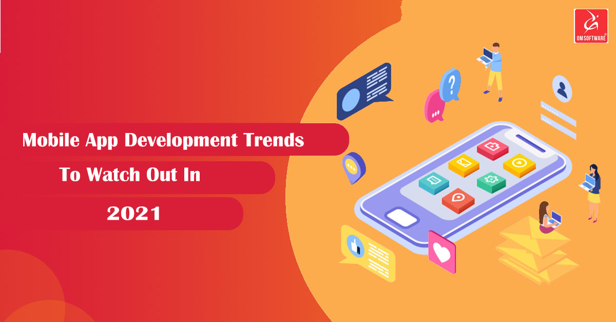
The mobile app development industry is constantly evolving and things have changed a lot. With smartphones becoming one of the most important parts of our life, the technology too has become an undeni

As time moves ahead towards more technological advancements, a new app is launched in the market. Several reports over the years have shown the positive impact of these apps on the market

A proper content marketing strategy is the key to taking your business to great heights. But, do you know that most of the businesses in today's time do not have a proper strategy? The content market
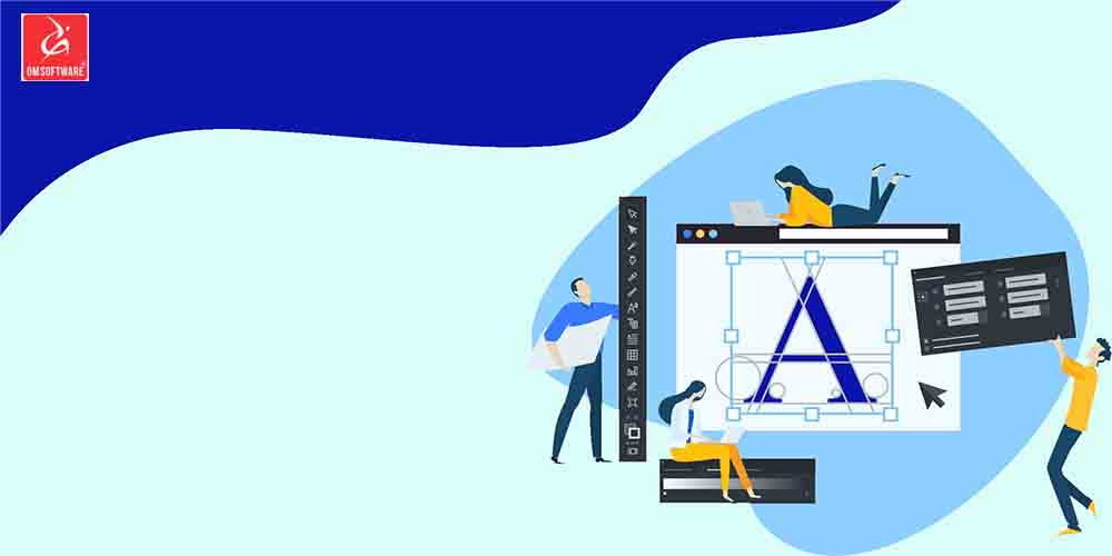
Every business should work towards having a logo for their business that can help to boost the impression. It has the power to uphold your brand's perception. Om Software can help you develop a log

Educational apps have come a long way and it's for the good. If we take a look, every student in today's time is glued to their smartphones. The coming in of smartphones and mobile apps have eased o

AI-based marketing is beneficial, but it has its own cons too. There are several reasons why you may want to include this in your business. But, there are also reasons why you should be careful with i
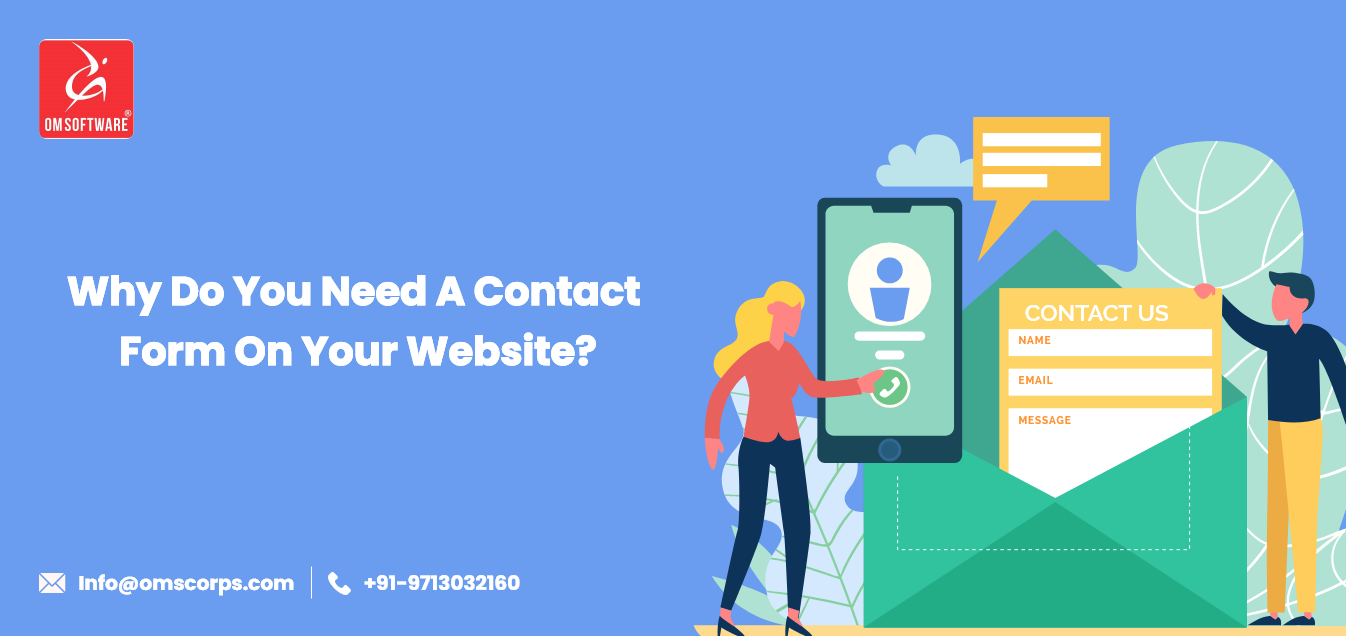
A lot of websites put their phone numbers or email addresses, thinking their customers to contact them. Apart from that, several websites also put their HTML mail to links. But is it that easy? No. No
It's 2020, and apps are the things that have played an essential role in enhancing the overall quality of life. Needless to say, these apps have had a huge impact on our life. Gone are the days when

JavaScript has played an essential role in transforming the digital world. No wonder, ever since this framework came into the market, things have turned upside down. Well, there's no reason to consid
No customer experience is obtained in a day. A better customer experience is a result of in-depth planning and delivery. However, there is a minimal approach to customer experiences. The businesses, o

The concept of "free" has always been fascinating and a little tempting. People tend to run behind free things. Quoting it from John Green's The Fault in Our Stars, "The World is not a wish-granti

Fintech apps have revolutionised how customers interact with financial institutions. With the rapidly moving time, customers have high expectations from Fintech apps such as fast, visual appeal and us

A logo is not only your brand's symbol but an entire representation. Without a logo, a brand loses its authority and is nothing. Every business should work towards having a logo for their business

Launching an app without knowing the market is like jumping into a lake of fire. It's extremely dangerous and risky. You surely wouldn't want to risk the shot, since you've already invested a lot.

Do you know what a successful business is? When you are getting regular sales from a group of loyal customers

The pandemic-induced school closures put 1.2 billion children out of the classroom globally. This made institutes to use stopgap arrangements such as virtual-led teaching for the continuity of educati

"Blogspot.in domains are not working. Reasons and Reactions"

Mobile app development has always been one of the most important things to consider. The digital world has contributed a lot to transform the businesses. With moving times, it has become necessary for

Here at OMSOFTWARE PVT LTD, we’re committed to providing development solutions for your business! We work with businesses of all sizes and primarily focus on small business clients. So today we want

Startups have become an ongoing thing in today's generation. The emergence of tech startups has taken over the world. The entire credit should be handed down to the privileges that today's youth are

The sudden outbreak of COVID-19 proved to be a threat and a problem. It led to massive disruptions in the work schedule, but we are ensured that we provide excellent services to our clients even from

E-Commerce is ever growing with the increasing popularity of Internet. In recent few years, several people made their way into providing some kind of e-Commerce based services or products. It helped t

Trying to seek expert help in Ecommerce Website design and development can be a tricky task to undertake. Who do you trust? How do you choose the right content management system developer? What type o

Today is Independence Day in USA, the day of several celebrations, the day of fun and laughter, the day of fireworks, the day of global importance, and above all the day of dignity for all US Citizens
An idea is always considered ridiculous till it proves itself a phenomenon. Same can be said for e-commerce that met with huge criticism in its early days, is it safe or not? Is it viable or not? With

OM Software Internet Solutions Pvt. Ltd. (OMS) is helping out small and medium enterprises (SME's) to achieve their business goals by integrating technology into all their core business functions. OM

Information Technology (IT) has transformed the way businesses used to function in past. Nobody imagined during initial days of Internet evolution that one day, it will override every functioning of a

Web hosting is an essential need for every business (no matter eBusiness or any offline business). Websites and web applications are a part of modern life. Therefore, in order to have their own websit

Today on eve of Thanksgiving I'm offering my heartiest congratulations to you (on beha

I worked with OMSOFTWARE on multiple project and I surely had a very good experience working with them. They have a professional, efficient and dedicated team that delivers a high end quality services...
David Wadley
(Australia)

OMS delivers the project in a professional way and has an outstanding service. We believe that excellent communication is the competitive edge OMSOFTWARE posses and execute in the most efficient way. ...
Ryantoh
(Singapore)

The entire crew has been fantastic to work with. Hearing out the customer and catering to their needs is what is missing in todays market. However with Omsoftware we never faced any issues. The were s...
Jon
(United States)

